
“The Pantone Color of the Year has come to mean so much more than ‘what’s trending’ in the world of design; it’s truly a reflection of what’s needed in our world today.” – Laurie Pressman, Vice President of the Pantone Color Institute.
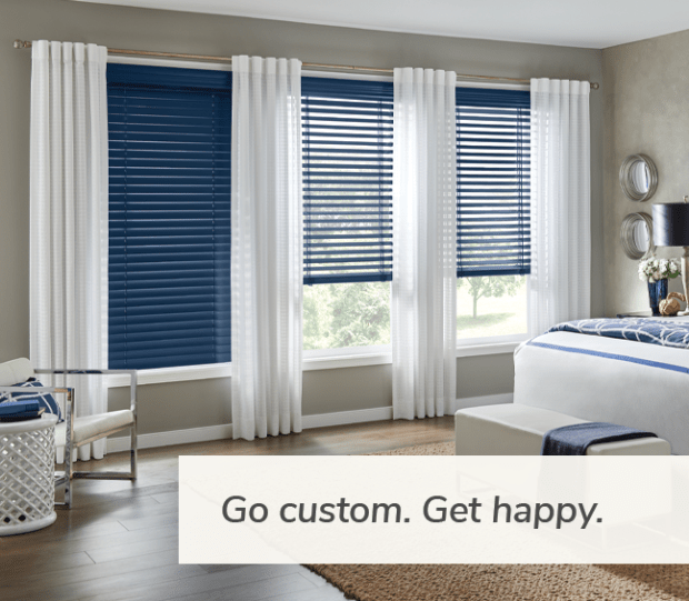
The 2020 Pantone Color of the Year is PANTONE 19-4052 Classic Blue. The Pantone Color Institute chose Classic Blue for its abilities in “Creating a stable foundation on which to build, PANTONE 19-4052 Classic Blue injects creative confidence into interiors, transforming a space through unique color combinations and tonal statements. Easily applied across so many different materials, textures, and finishes, PANTONE 19-4052 Classic Blue is a dependable blue that can take you in many different directions, expressing tradition and elegance, as well as unexpected boldness.”
If you want to bring the 2020 Color of the Year into your home, make sure you follow these 3 basic, yet essential steps to ensure you have the most stylish home in town!
Step 1: Use the 60-30-10 Rule
When introducing Classic Blue, or any other color scheme into your home, be sure to use the 60-30-10 Rule. To do this, mentally divide a particular room into 3 different percentage categories. 60% should be a dominant color, 30% should be a secondary color and 10% should be the accent color.
Some throw pillows, a vase or a great piece of art in Classic Blue will give a room that 10% pop of accent color that you need!
Step 2: Create Flow
To create the best look in your home, make sure your Classic Blue décor “flows” from one room to the next. Avoid using the same exact objects in each room, instead create an interesting visual experience with a mix of items, materials, and fabrics from one room to the next.
Step 3: Don’t Play It Too Safe
Go for that Classic Blue accent wall or couch! Sure, it’s less practical, but if you’ve always fantasized about it, do it! Life is short… Letting your home be too boring is the biggest mistake of all.
To stay up to date on design trends, schedule your free consultation or to request a design guide, reach out at pbrown@budgetblinds.com or visit my web page budgetblinds.com/Stillwater
-Pamela Brown


 This layered treatment includes Roman shades, custom drapery panels and a swagged decorative valance that adds colorful interest and elegance. For a room design update or refresh, just replace the valance for a whole new look without spending a fortune on new window coverings. For example, a brown and white subtle stripe or Greek Key patterned valance would give this room an entirely different vibe.

 The straight lines of the vertical sliding panels on this patio door are softened with a pleated valance that adds a colorful focal point in this dining room. Even when the panels are stacked off to one side, the door is stylishly adorned, enhancing the view.
 Matching valances create symmetry between the vertical and horizontal blinds in this bedroom. When window treatment styles don’t match, you can unify any room with coordinating valances.


